
↓
Introduction
Hungry In Vncvr is a startup instagram blog that creates food, lifestyle and travel related content.
Their mission is to share their experience with their followers and give them inspiration on where to eat. They also strive to help local restaurants and businesses by promoting them through their content.
Hungry in Vncvr was in need of a logo and branding to establish credibility, offer a unique visit to their followers and attract potential collaborations with other businesses.
My Role
Graphic Designer
July 2019 - August 2019
Project Goals
Create a logo and complimentary assets that match with client’s visions and goals
Have assets be clean and minimal to help support the content
Establish overall brand guidelines to keep a consistent look and style throughout
Process
In order to begin the design solution, I gathered inspiration to help finalize the decisions. The client’s goal was to have a fresh and modern look for their blog that felt welcoming and went well with the diverse content they would be posting.
Mood board
The photos for the Hungry In Vancouver mood board is inspired by vibrant, colourful and delicious food. The images show a diverse range of food from different restaurants and cultures, while the image styles go together seamlessly.
Colour Palette
The colours are soft but vibrant that help compliment the blog’s content. The main colour is a blue inspired by the city’s famous hockey team, Vancouver Canucks. The green also stems from that inspiration while the yellow and green act as contrasting counterparts. Overall, they give off a crisp and fresh feel that goes along with the company’s brand style.
Outcome
I first started off by sketching a variety of logo and icon styles that could be used for the company’s assets. The goal at this stage was to find a style that would be seamless enough to go with the diverse content while being striking enough when viewed.
Logo
The choice of having the donut as the logo was inspired by Vancouver’s beloved Tim Hortons; While the bitten part visualizes the “hungry” in the company’s name. Overall this logo is clean and bold that can be transferrable across future platforms for the blog.
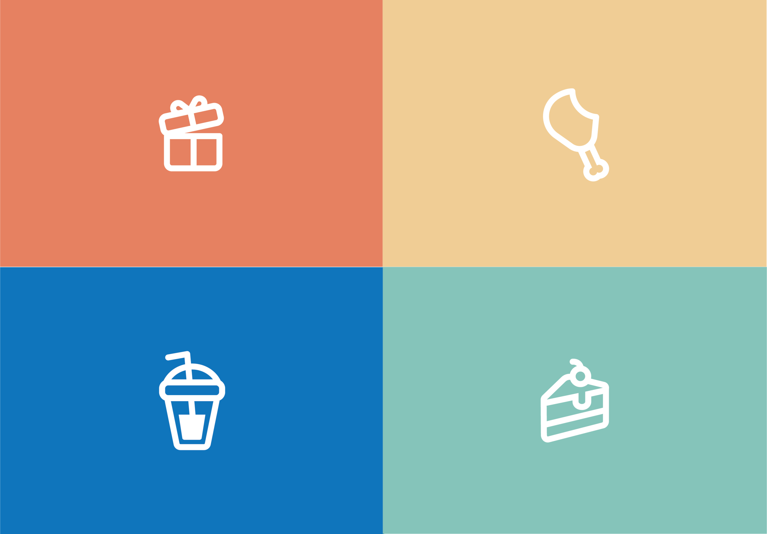
Icon
Since this blog’s main platform is instagram, having icons for the highlights feature of the application was important. The icon style matches the logo with its rounded edges and thick outlines. The same intent was put when making the food icon which is a chicken drumstick, having a bite mark just like the company logo. I also tried to invoke emotion when creating the gift icon; Having the lid slightly open would anticipate excitement and curiosity to the viewers.
In the future I think I would change the food icon to something that is more inclusive to other viewers who may be prone to eating plant-based, just to welcome all audiences who visit the blog.
Takeaways
Result
With Hungry In Vncvr’s new logo and assets, they now stand out amongst their fellow food bloggers. They are able to structure and organize their content with these assets and guidelines to provide a more unique and organized experience to their followers and visitors. Hungry in Vncvr continues to grow till this day and are excited to grow in their business with their new branding guidelines.
Reflection
This was a fun project to create because of the vibrant and charming assets that I got to create for this company. The challenges I faced during this project was finding the right look and feel that matched with what the client imagined. Another challenge was going over the need to have fine details and fancy specs to the assets and instead, create a minimal and clean look. By interviewing the client thoroughly and asking introspective questions, I was able to utilize that information to visualize what they were hoping for and to solve any potential issues later on.