Compass Card
UX/UI DESIGN
Roles
UX Designer
UI Designer
Usability Tester
Type
1 month
Passion Project
Tools
Figma
Google Forms
Team
Individual
Introduction
Compass Card is the reloadable fare card that is used by Vancouverites to ride everywhere on transit. It was introduced in August 2015 and has been used daily by thousands of transit riders.
Design Problem
There has been no app developed since Compass was introduced. Their current website lacks the convenience and ease of an app that allow users to load and manage their cards promptly. Other alternatives include vending machines located at skytrains or through the phone, but these methods can still cause a challenge. I used this opportunity to research and design an app for Compass users to solve this problem.
Project Goals
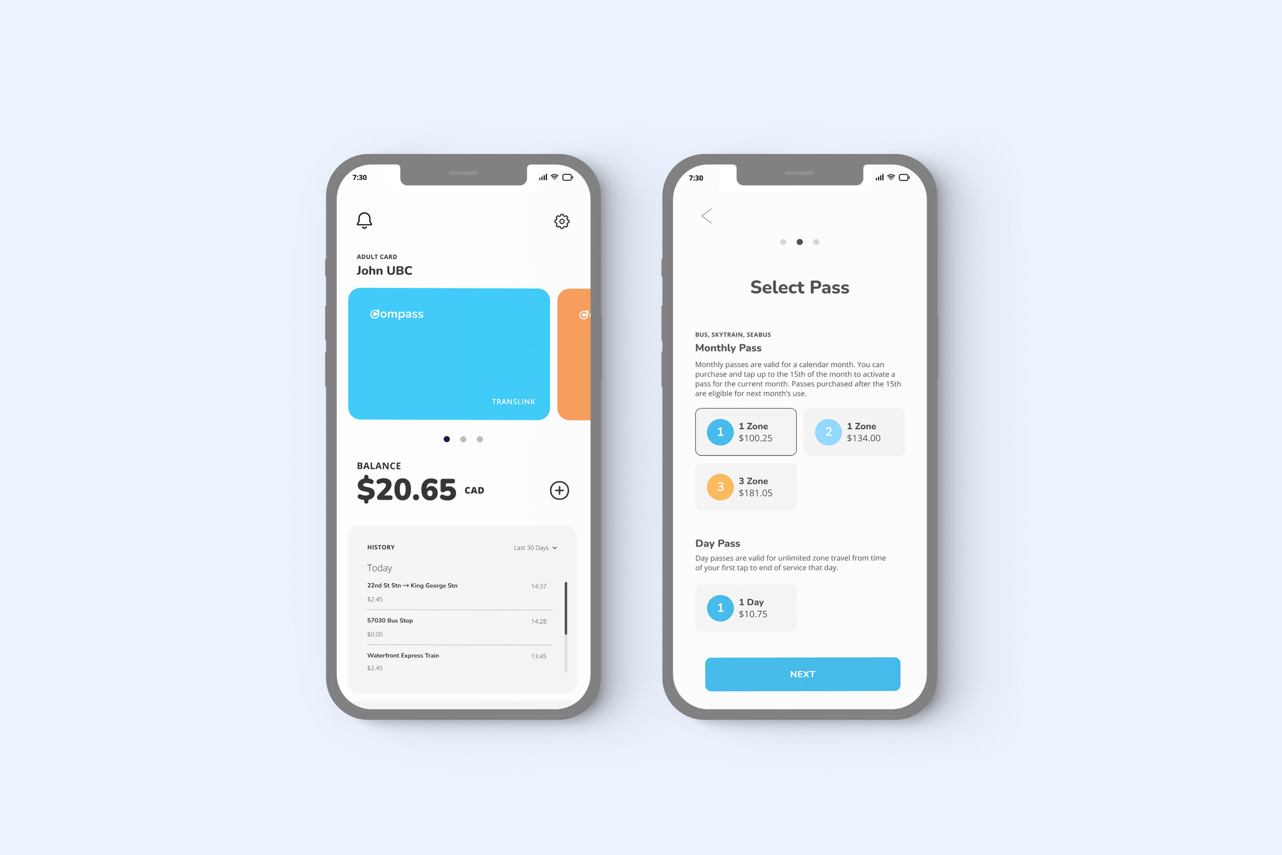
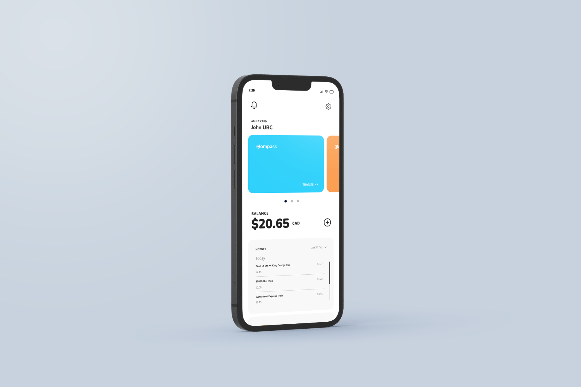
Load money onto Compass Cards quick and easy
Manage and store payment methods
Register for a new monthly pass or other programs provided by Translink
Match interface with the current branding for Compass Card
Easy to navigate for all sorts of demographics
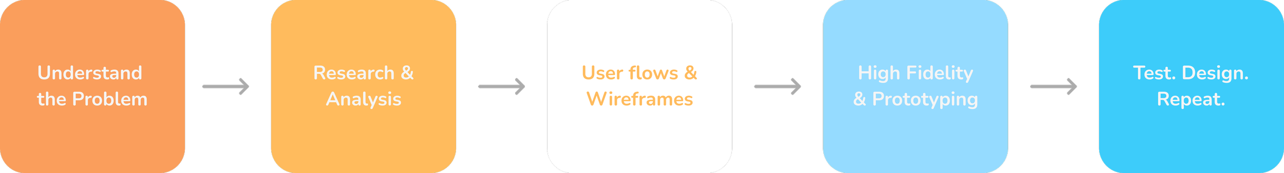
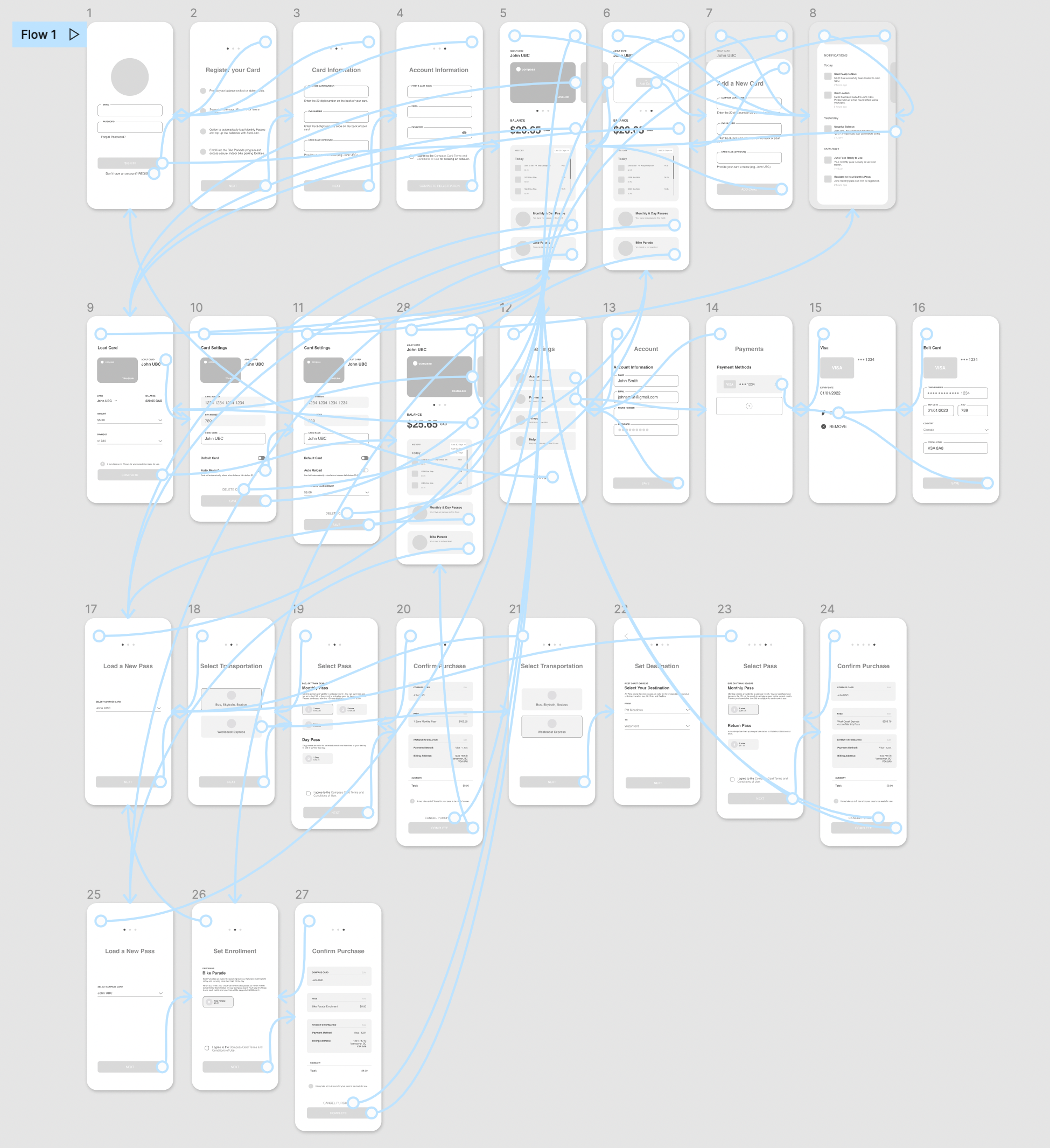
My design process for this project
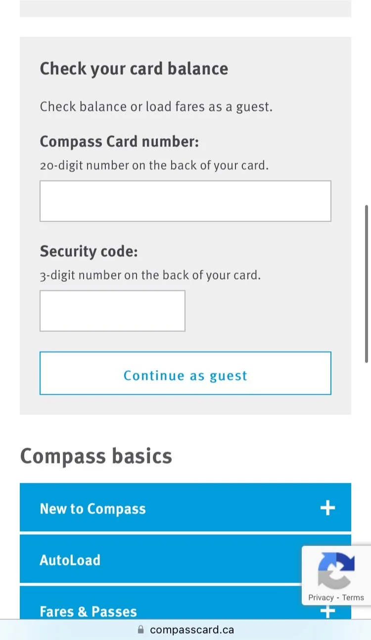
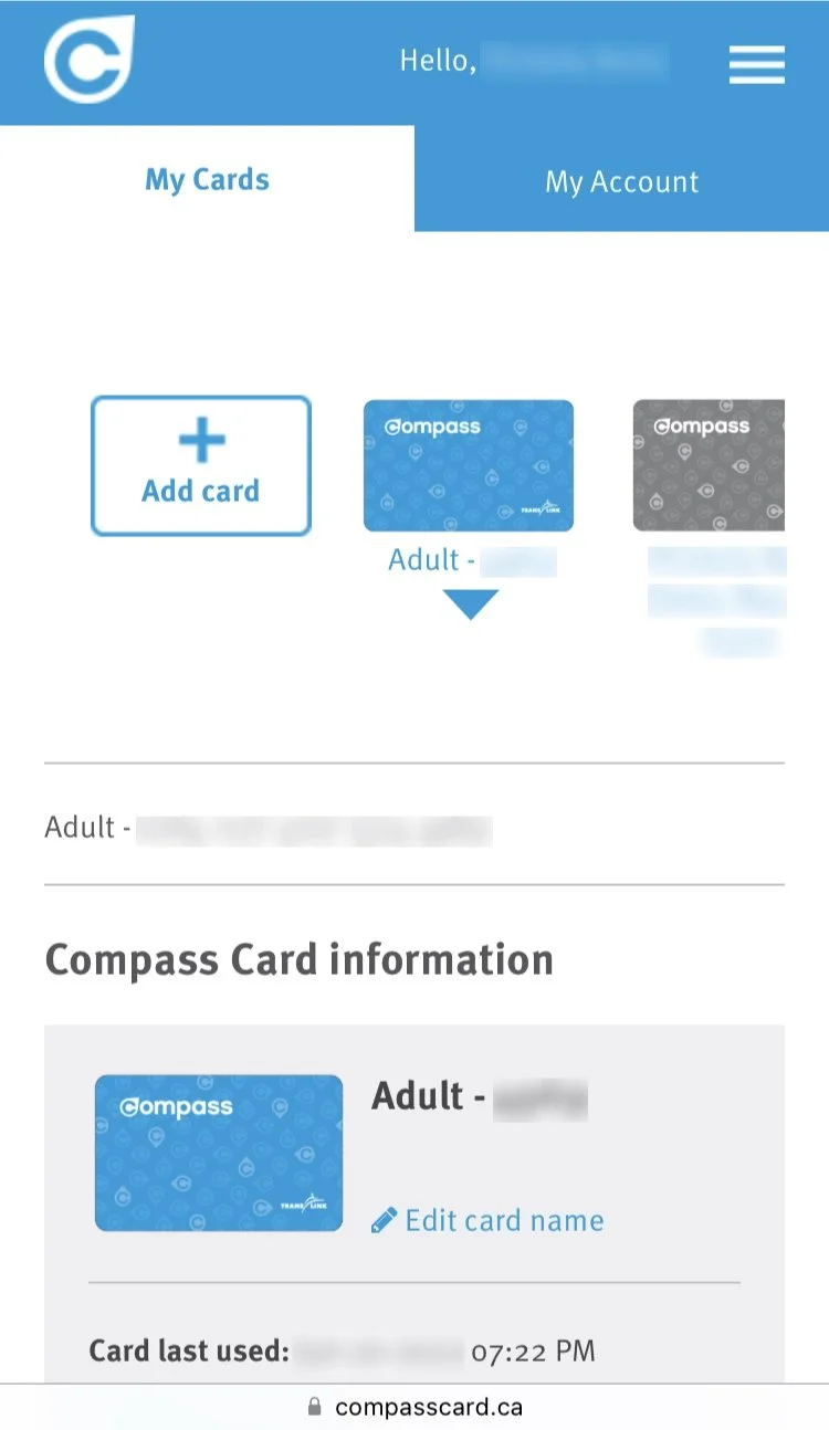
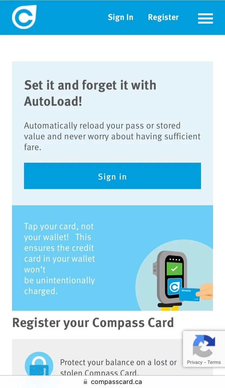
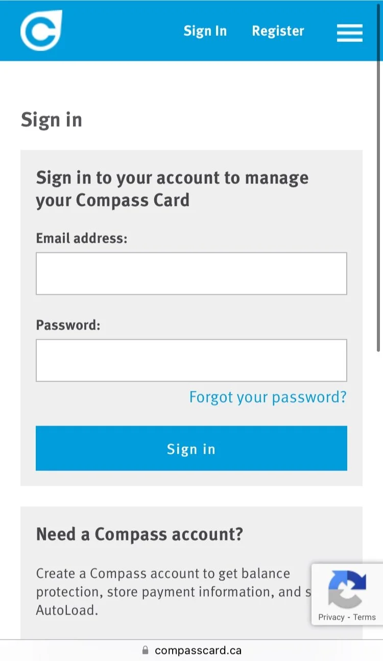
The current mobile-site design for Compass Card
In order to gain a full understanding of the needs for this app I familiarized myself with the current website and user flow. I sought out the thoughts from other compass users by sending out a mini survey using google forms. Here are the insights:
100% of users use Compass Card to ride transit as oppose to cash or credit card
80% load and manage their cards through the vending machine
60% of users find that the current website takes too long to complete a task
“There aren’t enough vending machines or the lines are too long. Typically out of service as well”
“Not convenient to use vending machines when in a rush”
“Not as comfortable using vending machines because of covid”
After making my findings, I began to research on a global scale to see what’s new, keep in touch with the latest design styles and trends. For the user experience aspect, I gathered inspiration with apps such as Starbucks that contains a card-loading feature which enables users to use their gold-cards and make an order ahead of time. This was a great example to reflect off of, as the Compass Card’s main goal is to load and manage their compass cards ahead of time without worry.
Research & Analysis
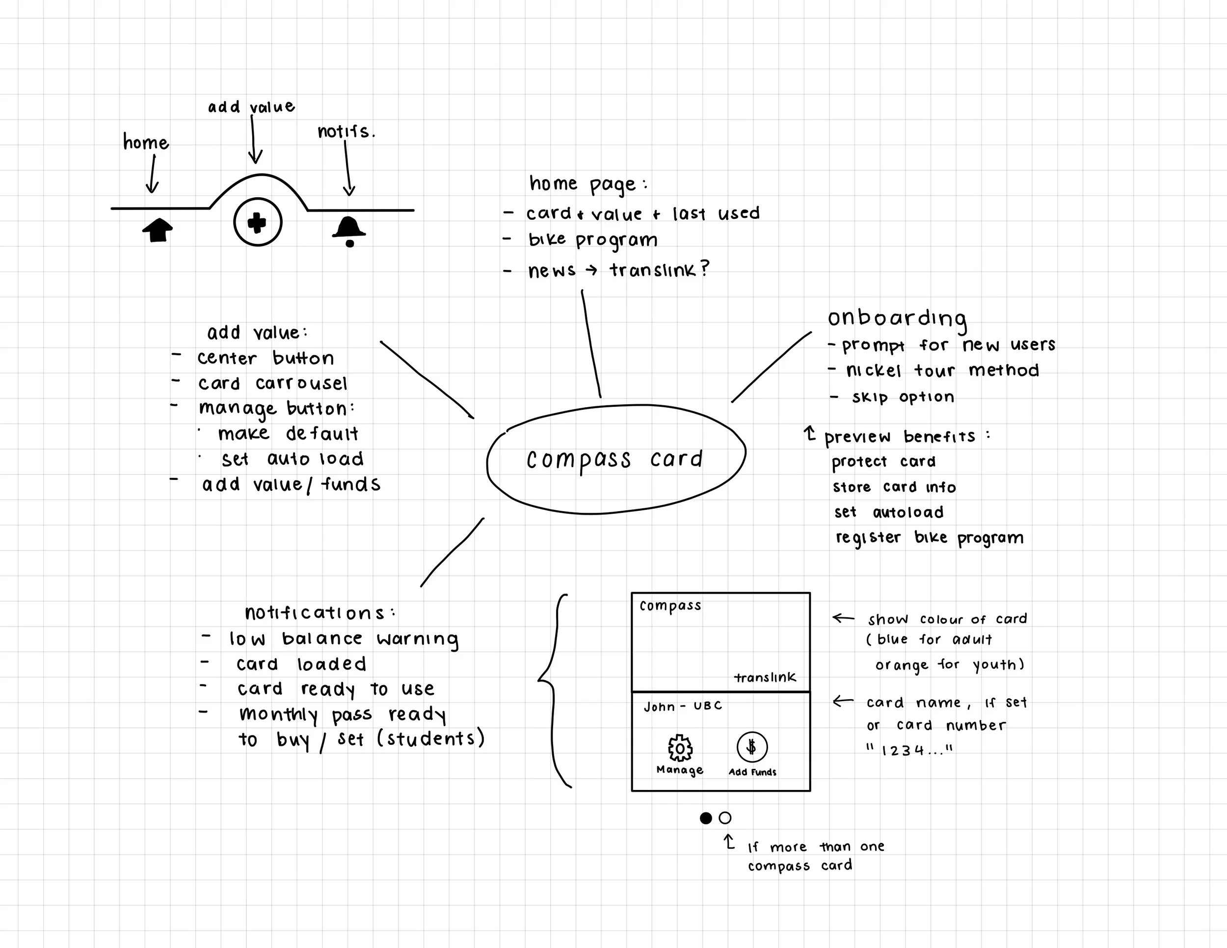
Brainstorm
I began with noting down ideas for the app: what would be needed, potential interface designs, types of notifications, etc. I referenced the Compass Card’s website to help with this process by using their information and how it could be organized/displayed.
When I began creating the wireframes, I realized that some of ideas that I originally planned would not coordinate seamlessly. One of them being a need for menu bar at the bottom; Having the features laid out on the home page with icons resulted in a much more simple and clean interface.
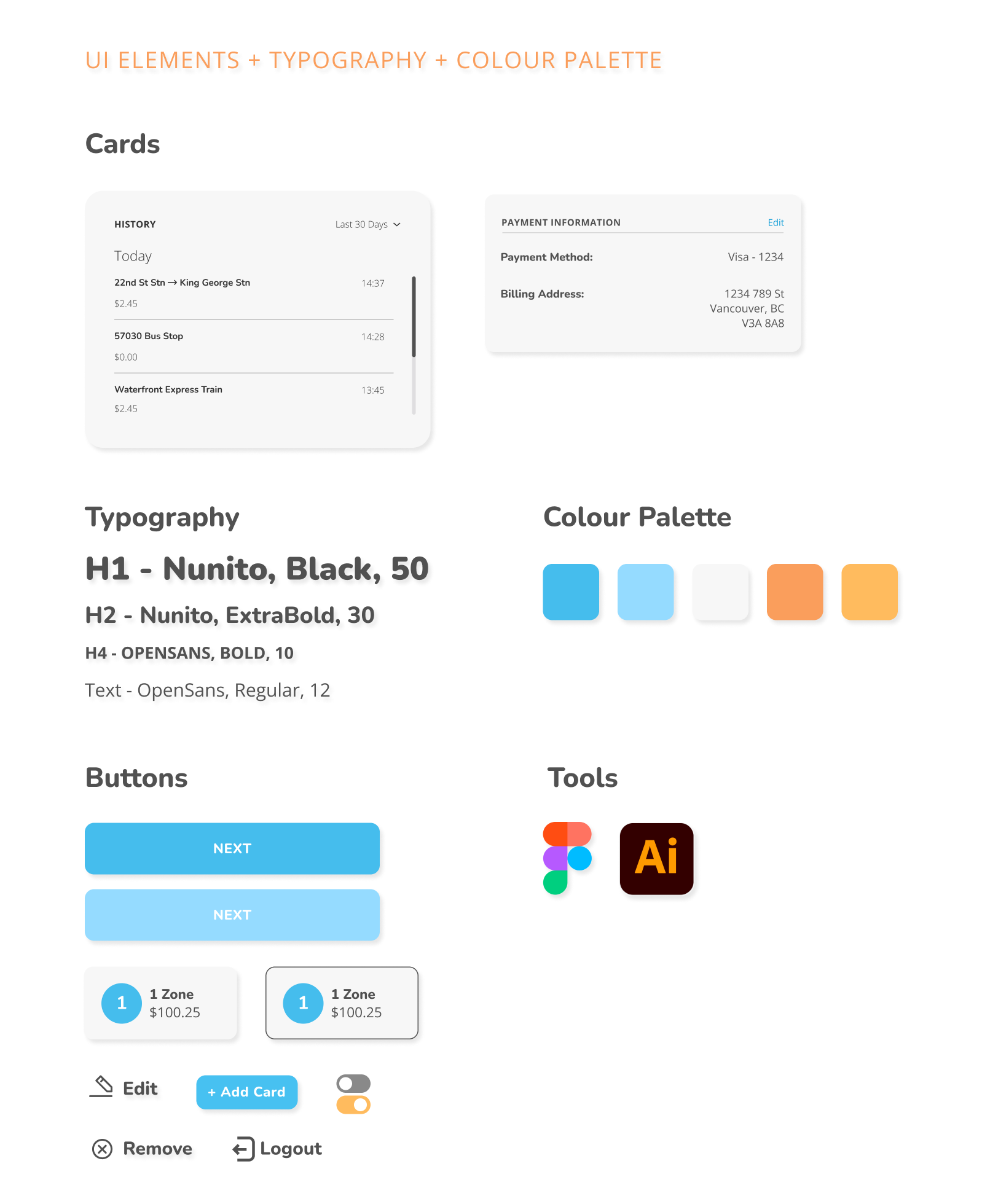
User Interface
Referencing Compass’ current branding, I revised the colours and typography to be more modern and eye catching. Having a brighter colour palette and a bolder font will create more engagement and enthusiasm to use the app.